Mixing iBooks Templates
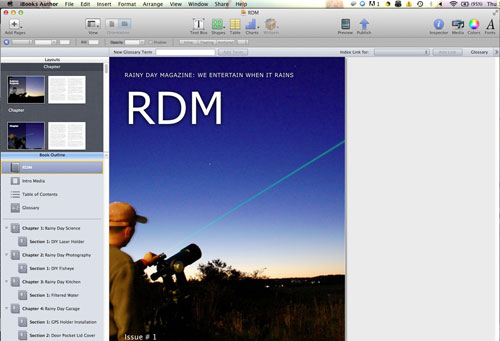
In the iBooks Author FirstUse article back in January, we showed how easy it was to use. We were able to use the default templates to lay out a mockup for the iPad. The preview feature enabled us to look at it on the iPad without having to upload it to a server, as is required with the Adobe workflow. This saved time and removed the need to work where there was internet access.

One of the many ways iBA saved us time and effort is the Table Of Contents (TOC) generation feature. As we laid out the different chapters (RDS, RDP, RDK, RDG), iBA automatically created and updated the TOC. The images used for the TOC are the same ones used in the Chapter. The Section headings are updated as they are added.

Combining layouts from different templates is very easy to do, whether they be the ones that come with iBA or the ones from the collections available from Jumsoft, Macmanus, or Graphic Node. A page, a section, and even a whole chapter may be moved from one template into another with a simple “cut & paste” action. All of the formatting, fonts, and related parameters were maintained without a problem. The mock issue we built was done using pieces from the default iBA templates. They were fine as a proof-of-concept, but not something we would use as a final template. To create a layout for a digital magazine,you might want more pizzazz, and that’s where the Jumsoft, Macmanus and Graphic Node collections have come in handy. We are experimenting with a few of them for a future iPad issue of RainyDayMagazine.

Apple may have created iBooks Author for textbook publishing, but we hope to be able to adapt it for use in creating digital magazines. If we can make it work, it will definitely change the way we publish RainyDayMagazine in 2012. Stay tuned.


Leave a comment