RainyDayMagazine's content can now be licensed for your print magazine or web site. Please contact us directly here. If you want to see something reviewed, then drop us a note with a link and we'll be happy to take a look. NOTE: Click here to read more about our approach to product reviews. |
| Dec 16, 2010- Rainy Day Gift Guide: iPad App... |
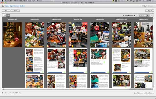
A few months ago, RainyDayMagazine was accepted into the Adobe Beta program for their new tools for publishing digital magazines for the iPad. A few other publishers (Wired, Martha Stewart, etc...) have published a version of their magazines using these new Adobe tools. The tools are not yet available to the general public, but they are robust enough for production use. In the process of learning how to use the Adobe tools, we took the opportunity to put together a little Gift Guide based on this month's articles. The RDM 2010 Gift Guide app just got approved by Apple for distribution in the iTunes App Store. The app is free and can be download now. You can find it by... [more]-Holiday Gift Guide: iPad App
|
| Nov 9,2010- Other Tablets... |
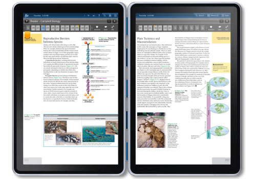
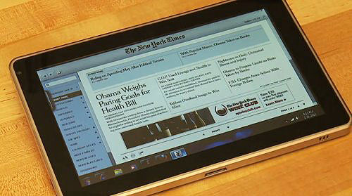
It has been six months since the launch of the Apple iPad, and every time a new tablet is introduced by another company Apple's dominance of the market gets a little stronger. We are not sure why companies like HP, Sony, and Microsoft are struggling to come up with an answer to Apple's iPad. OK, that is not entirely true; we know why. Why even BOTHER introducing something if it is just going to strengthen the competition's position? Take Kno (above) for instance. This company has what, on the surface, seems like a really cool idea: build a tablet targeted for the billion-dollar textbook market. However, at $899, it is DOA! A folding dual-screen setup will immediately be compared to a laptop, not a tablet, especially in that price range. While it may be an awesome digital textbook, it won't... [more]-Other Tablets
|
| Oct 29,2010- Interactive Test Issue... |
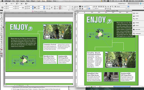
This is the last installment of our brief tour of the Adobe Digital Publishing Solution. Yesterday, we worked through Adobe's tutorial on putting together a single page using their DPS tools. Now that we are confident that all of the pieces of the process are functioning properly, we are ready to tackle a second and more challenging tutorial.
Today, we will show the workflow involved in assembling an issue with more interactive (slideshows, video, etc...) elements. Also, instead of just transferring the issue directly to the iPad, we'll upload it to Adobe's magazine server and download it wirelessly using the iPad. As with the single page issue, the layout of the various component were done using... [more]-Adobe DPS: Interactive Test Issue |
| Oct 28,2010-Digital Publishing Solution... |
We've spent the last few days getting the pieces of Adobe's Digital Publishing Solution (DPS) downloaded, installed, and running. The DPS is Adobe's set of tools for publishing interactive magazines for the iPad. It is currently in beta testing and is scheduled to be available in Q2 of 2011. The following are the main components of the DPS workflow:
This set of tools was developed by Adobe to enable magazine publishers to leverage their print material for the digital tablet market. The basic idea is, with a little extra work, publishers can add value (interactivity, links, etc...), repackage their print material, and deploy to a host of current and future digital devices...all without having to do any programming. It is an attractive proposition. We want to see if Adobe's solution will only work for the big publishing houses or will it also work for the slightly smaller operations like RainyDayMagazine. The DPS workflow is based around the latest Creative Suite InDesign application. While InDesign CS5 is the main component of the workflow, there are a few other pieces which help connect everything together. One of the "glue" components is... [more]-Adobe DPS: Test Issue
|
| Oct 27,2010- Adobe CS5 QuickStart... |
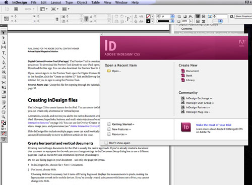
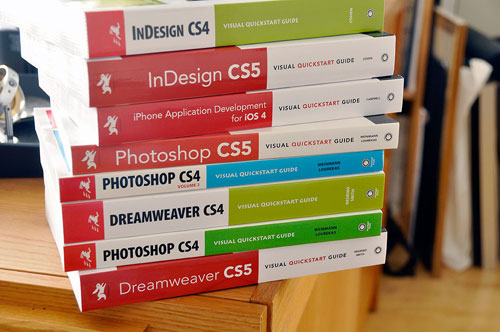
The tools for digital publishing have evolved quite a bit over the past thirty years. At the beginning, PageMaker, Quark Xpress, and Word were the tools of the trade. It was possible for one person to be an expert on all of these applications. Granted, the digital portion of the entire publishing workflow was was limited, but still it was possible to learn it all. The suite of applications used to create, layout, and manage the digital publishing process keeps growing. Today, just familiar with a few of them is difficult enough, being an expert in every application necessary to produce a digital magazine is next to impossible. Keeping current with the updates to the applications we currently use (Dreamweaver, Photoshop) is challenging enough. With our venture into publishing for the iPad, we will now need to get up to speed on a component of the Adobe CS suite called InDesign. It came as a part of our Adobe CS4 package. As the application is for laying out pages for printing, we never even bothered to install it. However, now that Adobe has extended InDesign CS5 for... [more]-Adobe CS5: QuickStart
|
| Oct 26,2010- iPad Magazine Publishing... |
The iPad has changed a lot of things in the six months since its introduction. A whole cottage industry of game and utility apps has sprung up for the device. Companies are jockeying for position around which technologies will be/should be/never will be supported on it. Publishing houses are scrambling to understand what the iPad will mean for books, magazine, and the web. Magazine publishers are especially interested in the iPad as a platform. The tablet form factor is a natural fit for reading magazines. The iPad/AppStore combo is especially suited as it can allow subscribers to connect to the web, purchase, and download new issues. Sites such as Wikipedia and TED have iPad apps which enable users to view their content in a magazine-ish format. Flipboard has even made it possible for iPad users to create their own personal magazines using content from Facebook, twitter updates, and other feeds. The biggest splash this week was... [more]-iPad Magazine Publishing
|
| Aug 17,2010 - AA iPhone app |
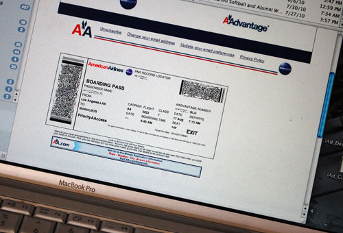
Being able to print boarding passes at home or at the office has made the airline check-in process a lot more convenient and less stressful for travelers. By shifting the printing and paper cost to the consumer, it also enables airlines to reduce costs. It has been one of the few "win-win" situations with airline travel. Recently, AA introduced an improvement which we had a chance to try out on our trip back to Boston. It is an option available to tech-savvy travelers and may make the boarding process even better. How? By eliminating the printing of boarding passes altogether. For those with an iPhone or an iPod Touch, AA has released a free app which enables a passenger to... [more]-AA iPhone App
|
| Aug 10,2010 - Wikipedia Discover |
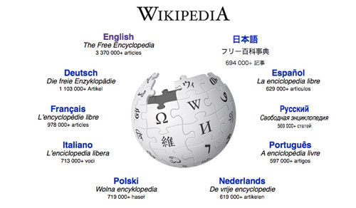
Next to Google Search, Wikipedia is probably one of the more useful resources available on the Internet. This online encyclopedia has over 3,000,000 entries, is maintained and edited completely by volunteers, and is used by millions of people everyday. Best of all, it is completely free...free of charge, free of advertising, free of the "noise" which plagues so many other sources of information. It is difficult to imagine how it could be made better.
Well, an iPad app call Discover has just kicked Wikipedia's usefulness up a few notches. The app is free and is available on iTunes. It is a viewer which takes the information on Wikipedia and... [more]-Wikipedia Discover
|
| Aug 4,2010 - iPad connection kit |
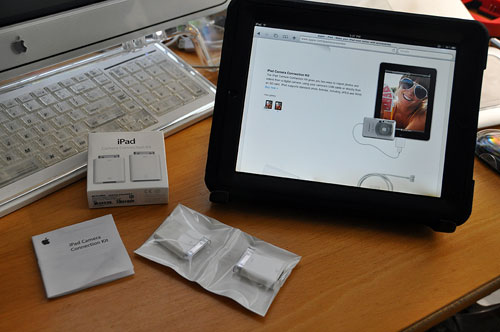
We have been using the iPad since the day it was available. It has been no secret that we think it is a game changer. However, it does not mean we think the iPad is perfect. There are things we wish Apple had done differently, made better, or included. One of the things we wish Apple had included is a standard USB port or an SD card reader. When in the field, were hoping we would be able to use the iPad as a digital lightbox. The iPad's size, weight, and long battery life would have made it a perfect tool for quickly checking the quality of an image without having to lug around a laptop. However, there are no built-in mechanism for attaching a camera to or insert a CF card into the iPad. The only way to "talk" to the iPad is via the optional Camera Connection Kit accessory. Since the kit is optional, the least Apple could have done was make the Camera Connection Kit more widely stocked at launch time. After waiting months for the kit to become available, we were finally told that we needed to order it through the online store. When we did order it, the wait was another six weeks. How difficult could it be to... [more]- iPad connection kit: FirstLook
|
| Aug 3,2010 - iPhone prototyping software |
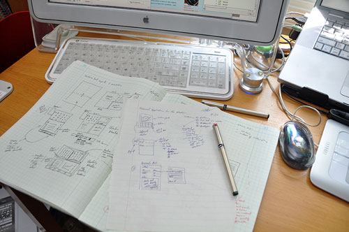
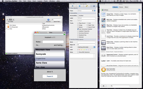
Ask any house builder and they will tell you, don't put the drywall up before you do the plumbing and electrical. The advice holds true for software as well. Unless you have worked out the basic structure of your app, don't waste time with precise button placement, color selection, or the creation of a more realistic prototype. The pencil and paper method is the fastest way to test out a lot of user-interface ideas, narrow in on a direction, and work out the flow of an app. It is only when the ideas have been fully fleshed out on paper should one consider taking them to the next level.
There was a time when the only techniques used for making prototypes were screen grabs and "cut & paste" with a drawing program. Now there are many different software tools to help create native-looking software mock-ups. Some of them will even allow button presses, bring up new screens, and simulate other actions. We have selected a few of these prototyping tools to examine in detail. These tools fall into three general categories: visuals only, simulators, code generators. One workflow would be to use Photoshop to create a realistic looking screen, download it to the... [more]- iPhone prototyping software
|
| Aug 2,2010 - Portable prototyping studio |
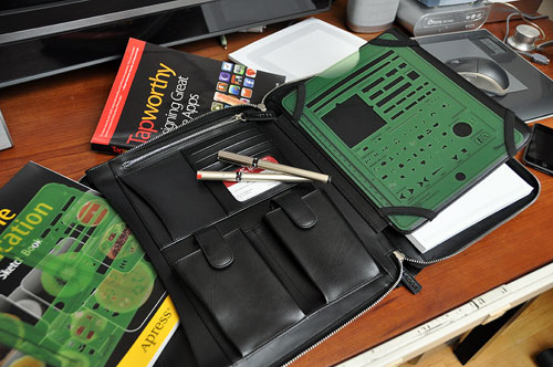
Last week we posted an article on iPhone user interface prototyping. Our conclusion was that an analog approach was the quickest way to approach the initial task of designing the UI. We had assembled a few tools specifically designed for such an effort and were eager to give things a try. Fortunately for us, the weather had turned a comfortable 76º in Boston over the weekend. We thought it would be great opportunity head out to a cafe and put some of our UI thoughts to paper. We started looking around the office for a suitable carrying case for all the stuff (stencils, pads, etc...). However, none of our art portfolios, laptop bags, or iPad cases were right for the job. They were either too small, too bulky, or too big. It then struck us that an item which we had just received for this month's head-to-head iPad case review would make a perfect carrier for all of the prototyping gear. The leather case is from M-Edge, a maker of things fashionable and protective for eReaders. Unlike many iPad covers and cases, this one was designed for carrying an iPad along with some other... [more]- Portable prototyping studio
|
| July 30,2010 -iPhone prototyping... |
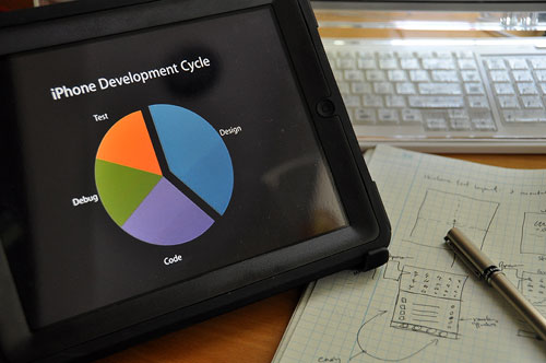
Designing and prototyping is a big part of creating great software applications. Skimping on the design step in hope of shortening the development cycle is a typical rookie-project-manager mistake and a guaranteed way to totally trash a project schedule. For the past few weeks, we have been working our way through the large collection of videos on iPhone development from past Apple World Wide Developer Conferences. The take-away message from those videos is design, refine, design...before ever consider putting down any code. This we already knew and are not surprised to see it being so strongly emphasized by Apple. Developing for the iPhone is... [more]-iPhone UI prototyping
|
| July 14,2010 - iPhone programming books... |
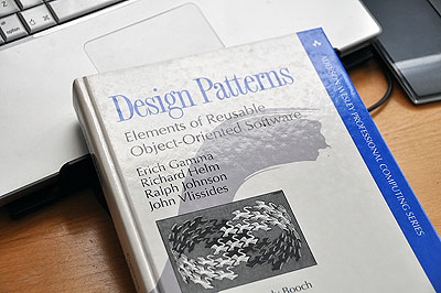
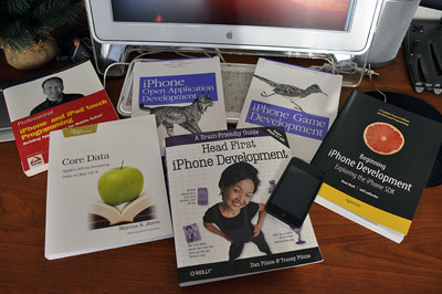
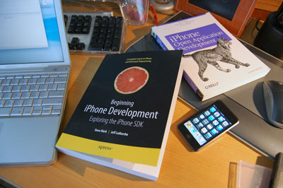
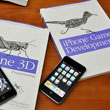
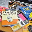
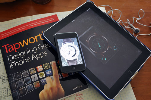
"What do I need to get started?" This is the question we get most often from readers regarding iPhone development. The answer is pretty simple: an Intel-based Mac computer (PowerPC CPU is not supported by the SDK), the iPhone development environment (FREE from Apple), and a few good "introduction to iPhone programming" books. We have looked at a few programming books in the past, some of which were written before Apple had released the iPhone SDK. These were useful when there was no "official" development platform from Cupertino and you had to jailbreak the iPhone to do any programming for it. With the release of the official iPhone SDK, though, these older books are out-of-date, but can still be illuminating. We thumb through them every once in a while to remind ourselves how much easier it is programming with Xcode and the iPhone SDK! When we think "programming books," the name O'Reilly usually comes to mind. This may be because O'Reilly has been a publisher of technology-related books for as long as we can remember. It may also be because of the iconic covers of their books. Whatever the reason, we find most of the iPhone programming books in our collection are from O'Reilly. The basic ones (Allan, Hockenberry) cover the fundamentals of how to get started, from setting up the Xcode development enviroment to applying for admission to Apple's App Store. However, by necessity, none of the books can... [more]- iPhone programming books
|
| July 8,2010 - TapWorthy Apps:Emerald Sequoia... |
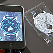
The App Store has a huge collection of timer apps, clock apps, and apps which count down in every imaginable way. We use them all the time, but we usually don't launch them just to look at them, until now. When it was suggested that we should check out Emerald Sequoia, we have to admit that we did not put that suggestion on the top of the "do-it-now" pile. Then we heard that Emerald Sequoia released an amazing app for the iPad. Still, we didn't get it. What could be so fascinating about another clock application on the iPhone? Then we actually took a look at their apps. The guys (Bill and Steve) of Emerald Sequoia are old Mac programmers that have taken what they have learned from their years of software development and used it to create one of the most visually satisfying iPhone apps we have seen in a while. If you love wristwatches, we don't have to explain this app any further. If wristwatches don't do it for you, we won't bother trying to convince you. However, because we were talking about how to create "tapworthy" iPhone apps yesterday, we felt it appropriate to discuss the... [more] -TapWorthy apps: Emerald Sequoia
|
| July 7,2010 - TapWorthy ... |
It was 1994 and the world had just been introduced to the Newton MessagePad. The Newton was a handheld personal digital assistant (PDA) which was supposed to help you manage your email, to-dos, and other bits and pieces of your day. Some of us had the opportunity to work on mobile apps for the Newton in those early days. We remember spending many a night arguing back and forth over what kinds of applications would make sense to offer for the MessagePad. We debated passionately on whether we should be making applications more powerful or simpler (and easier) to use, and whether to add that "awesome advanced feature" or to "keep it pure." We also had intense discussions regarding how to make the best use of the smaller screen.
In the ensuing sixteen years, mobile device designers have tried a lot of things, learned a lot of lessons, and have created many successors to the Newton MessagePad (Palm, PocketPC, Blackberry, et cetera). The latest winner is clearly Apple's iPhone, with its high resolution multi-touch screen, long battery life, and video-conferencing cameras. What we find interesting as software designers is... [more] -TapWorthy
|
| July 1,2010 - Finished Chapter 6... |
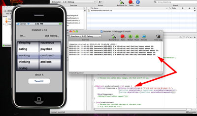
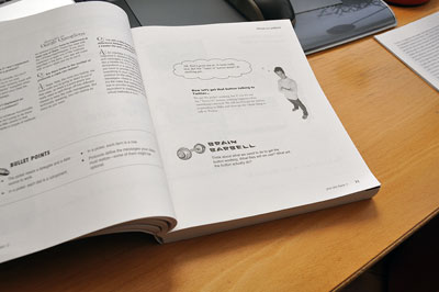
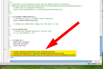
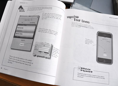
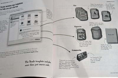
It has been a while since we updated our progress with the HeadFirst iPhone Development guide. We have been working through the examples from Chapter 4 through Chapter 6. The going was a lot slower due to the constant "Would you review this? Should we review that?" interruptions. The Holiday weekend will give us some "quiet time" to focus and to consolidate some of the work we have done so far. However, here a quick summary of where we are. We have completed Chapter 4-6. These chapters were interesting from several perspectives. It finally felt like we had learned enough to build something that might actually be useful. OK, minimally useful, but still, it was a hopeful sign. We learned a bit more about debugging in the iPhone environment: how to set breakpoint, look at variable, step through code. We also got more exposure to... [more] -Finished with Chapter 6
|
| June 02,2010- Multiple monitors ... |
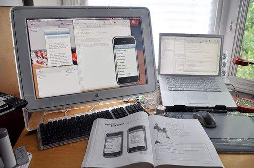
We were distracted by the flurry of iPad-related stuff coming into the office and neglected our iPhone (and now iPad) programming studies. However, the Memorial Day weekend gave us some focused time to work on the last bit of Chapter 3 and to begin Chapter 4 (multiple view apps). The various teaching techniques of this book is starting to have their effects. Tons of graphics keep our brains engaged. The conversational style helps us pay attention to the "dialog." The various challenges, exercises, questions, and activities are surprisingly... [more] -Multi-monitors
|
| May 11,2010- iPad Covers ... |
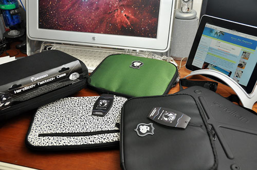
An iPad cover is one accessory that many new owners are probably considering for their newly acquired tablet. A few weeks back we showed readers how to get by with what they already had around the office, including how to make a cover out of an old composition notebook. Today we'll take a look at a few commercially available options for the less DIY-inclined. There are a LOT of iPad covers on the market. We are going to cover a few general ones in this write-up. It will be basic enough to serve as a guideline for evaluation covers for different needs. We'll continue to review specific covers when we find ones which are unique, innovative, or in some way worthy of consideration. We look for three things in an iPad cover: the kind of protection it offers, whether it makes the iPad easier to carry/transport, and if it has any feature that makes the iPad easier/more comfortable to use. First up are the basic covers. They offer padded protection for iPads while in transit. These covers should be light, slim enough to fit into a backpack or briefcase, and allow quick access and easy removal of the iPad. One case which fits the bill are the sleeves from Slappa. Slappa sleeves have a nylon outer shell that shields against moisture, an outside pocket for cords and such, and is... [more] -iPad Covers
|
| May 7,2010- Navigating a Touchscreen UI ... |
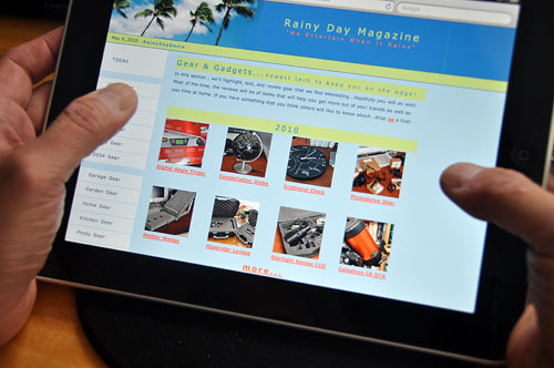
The iPad is a great example of how difficult it is for some folks embrace new/different things. For the first time in thirty years a new computer interface has been created, Nintendo PowerGlove, Wii controller, etc. notwithstanding. In recent weeks, we have seem many attempts to "convert" the iPad into a portable laptop. Not only do we see these efforts as folly and doomed to fail, we believe they are a hindrance to the development of a better computing interface. The multi-touch user interface made a huge splash at the TED conference on February 2006 in Monterey CA. A different and more limited version of multi-touch technology became widely available with the release of the first iPhone. With the iPad, Apple has pushed multi-touch interaction a few more steps toward general acceptance. Trying to make the iPad LOOK and WORK like a laptop is silly and the user experience will be frustrating. Besides showing a total lack of imagination, trying to remake the tablets into laptops will ultimately end in failure. Instead, we should be exploring and expanding the boundaries of the touch interface and the tablet form factor. A touch-based user interface is very different from the mouse/pointer centric one. The concept of "hovering" does not exist in the multi-touch world (yet). This has created a host of problems for sites with... [more] -Navigating a Touchscreen UI
|
| May 06,2010- The perfect tablet ... |
Hardware companies think that writing software is easy (Sony) and software companies think that building hardware can't be that hard (Microsoft). Apple has been doing both as an integrated discipline for a few decades. Apple has created a culture that embraces both software and hardware, and replicating that culture is not as easy as some would think. This is the main reason why even though "tablet PCs" have been around for almost ten years, they never got out of their niche markets. Yes...they can do everything a regular laptop can do, but they are heavy, expensive, and have crappy battery life. The Apple iPad is the exact opposite of all of that. It can't replace a laptop, but it is light, inexpensive, and can last for days between charges. What got us onto this topic was a recent discussion on a few blogs with some very knowledgeable folks. We were trading thoughts with some other posters about the HP Slate, HTC, JooJoo, and what our idea is of the "perfect tablet."
In the course of the discussion, the following transpired which we thought was worth sharing: The challenge: "OK, let's do this. I will compare my netbook against an iPad: HP Mini 110, $300, 10-inch screen, 1GB HDD, 1GB RAM, 1.66Ghz Atom, 3 usb ports, TV out, Various media card slots, Windows 7, Webcam, Keyboard, the ability to... [more] -Building the perfect tablet
|
| April 26,2010- iPad Protection ... |
The Apple iPad display is amazingly bright and viewable. The main reasons are the ipad's In-Plane Switching (IPS) LCD and its LED backlighting. The two technologies gave the iPad impressive brightness and a large 178º viewing angle. IPS was developed over ten years ago by Hitachi to address some inherent issues of LCDs: poor viewing angle, color inaccuracies. The advantages of LED backlighting are its low cost, long life, immunity to vibration, low operational voltage, and precise control over its intensity. The main drawback is that it requires more power than many other backlighting methods (ELP, CCFL, WF). Click on the various iPads in the image below to see the screen at increasingly obtuse angles to see what we mean.
Unlike a laptop screen, the iPad's screen was designed to touched. In order to keep the smudging to a minimum, the screen has a fingerprint-resistant oleophobic coating similar to the iPhone 3G. From the Apple pamphlet ... “iPad has an oleophobic coating on the screen; simply wipe iPad’s screen with a soft, lint-free cloth to remove oil left by your hands. The ability of this coating to... [more] -iPad Protection |
| April 23,2010- ePublishing for the iPad... |
The project we completed last week was to take the 1000 Chinese characters and convert it into an eBook viewable on the iPad. Converting the collection of images into a Word file took us some time. We had to work out all of the steps and export formats. As there were 1000 different characters, getting one out of sequence would have made the error difficult to track down. However, once we got into the rhythm of workflow, we were able to convert that and the rest of the different calligraphy styles in no time.
When we were done, we had four different versions of the 1000 Character text. Something like this would have been quite difficult to do physically, but to publish it as an eBook, it was no sweat at all. [Permalink] -ePublishing for the iPad
|
| April 16,2010- ePublishing for the iPad... |
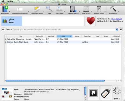
The iPad has sold more the 500,000 units since it went on sale two weeks ago. Its success has surprised even Apple, and it has pushed back the overseas release date of the iPad by a month to satisfy US demands. We have spent quite a few hours getting to know Version 1.0 of the Apple iPad. One thing is for certain, this device is a game-changer for ePublishers. As both PDF and EPUB are standards, there are many ways to get documents into those formats. On the Mac, just about any text file can be converted to .pdf format via the "Save As PDF" command under the standard Print function. We have already shown how simple it is to convert a .pdf file into a EPUB file via CALIBRE. The process to create eBooks for the iPad is... [more] -ePublishing for the iPad
|
| April 7,2010- Free iPad Apps ... |
The iPhone has been a success in part because of the large number of third-party apps available for it. Likewise, the usefulness and ultimate success of the iPad (beyond the early adopters) will depend heavily on what developers create for this new form factor. We expect to see a flurry of activity now that the iPad is out "in the wild." We also expect the pace of app releases to snowball as we head into the Fall. The iPad came with a set of standard apps:
At launch time, there were already over 3,000 apps written specifically for the iPad. The price of an iPad app is averaging a few dollars more than iPhone apps, although many of them are free. We scanned the AppStore and downloaded a bunch of free but promising-looking ones. We expect this set to change. As with anything free, some are worth the cost, some not so much (really, some of them we should be paid to use). We have culled the list and settled on a set which... [more] -Free iPad Apps
|
| April 6,2010- iPad accessories you already have... |
Whenever a new Apple gadget shows up on the market, what follows is an inevitable deluge of gadget-specific accessories. The iPad will be no different. It will spawn an entire ecosystem of iPad-specifc screen protectors, carrying cases, docks, extended battery packs, and attachments. However, well-gadgetized geeks may already have many of those accessories in-house. Yesterday we showed how a mouse pad could double nicely as an iPad stand. Today, we took a quick look around the RainyDayMagazine office and came up with half a dozen things which could be repurposed for the iPad. Some gear was relatively new, and some were surprisingly old and no longer actively used.
The mouse pad with a wrist rest worked as a stand because the friction of the pad kept the iPad from sliding. However, as the back of the iPad is curved, pretty much any soft wrist rest would work just as well as long as... [more] -iPad Accessories Your Already Have
|
| April 5,2010- iPad FirstLook.. |
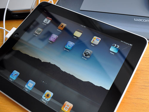
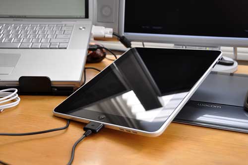
Now that our iPad has been unboxed we thought we would provide a quick tour of the unit and offer a few observations about the physical aspects of this device:
The frame is made from a single piece of aluminum. It is tapered out from the center to the edges, giving the iPad a much thinner overall appearance. It is not just a nice visual trick, the curve also makes the iPad more comfortable to hold. The first thing we noticed was that the feel of the iPad is much more substantial compared to that of the Amazon Kindle. The finish of the back is smooth but matte so fingerprints do not show. The glass of the LCD has an oil-resisting (oleophobic) coating to minimize the amount of fingerprints. This is not to say the... [more] -iPad FirstLook |
| April 4,2010 |
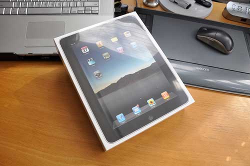
Our Apple iPad showed up late in the afternoon yesterday. We had a previous commitment for the evening so we had to wait to do the "unboxing," but, wow, the wait was worth it. We ordered the 16GB WiFi version of the iPad, which is the least expensive model of the iPad line. Many people consider it a risk to buy the first generation of anything, especially if it is something completely new to the market. In our "previous" life, we were Newton MessagePad developers, so being on the bleeding edge of technology is not uncomfortable for us; actually, it's when we are the most excited.
So nobody was surprised that we had no hesitation in plunking down $500 for a device no one had never seen before...especially since the gadget was from Apple. |
| April 3,2010- iPad Delivery.. |
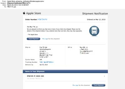
The much anticipated iPad delivery date has arrived. We had been tracking the package's progress since March 29th, when it left Shenzhen China, and followed its progress across the world to its final Boston destination. UPS last updated its delivery status as having left East Boston at 8:09 A.M. We expected to see the truck pull up to the office sometime this morning...
However, the morning came and went, but no iPad delivery. It wasn't until much later in the afternoon that the UPS truck pulled into our delivery dock. Ours was his last iPad delivery of the day.[Permalink] -iPad Delivery
|
|
....... 2009 ......
[Dec] [Nov] [Oct] [Sep] [Aug] [Jul]
[Jun] [May] [Apr] [Mar] [Feb] [Jan]
....... 2008 ......
[Dec] [Nov] [Oct] [Sep] [Aug] [Jul]
[Jun] [May] [Apr] [Mar] [Feb] [Jan]
....... 2007 ......
[Dec] [Nov] [Oct] [Sep] [Aug] [Jul]
[Jun] [May] [Apr] [Mar] [Feb] [Jan]
....... 2006 .......
[Dec] [Nov] [Oct] [Sep] [Aug] [Jul]
[Jun] [May] [Apr] [Mar] [Feb] [Jan]
....... 2005 .......
[Dec] [Nov] [Oct] [Sep] [Aug] [Jul]
[Jun] [May] [Apr] [Mar] [Feb] [Jan]
....... 2004 .......
| ||
| RainyDayBuzz* | ||
|
|
||










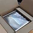
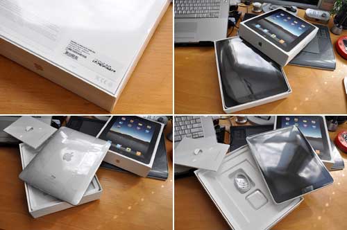 The box's content was neatly organized, well laid out,
and easy to remove. There were no ugly twist-ties, rattling pieces, or loose bits to spoil the mini-ceremony. Even the

