Dramatic changes in user interface design has happened only a few times in personal computing history. The most notable one was when the interface went from the command lines of CP/M and DOS to the Apple Macintosh. A decade or so later, smaller computing devices with touch-sensitive screens (Apple Newton, Palm Pilot)
ushered in new ideas on how one should navigate and interact with those devices. It was another 10 years before the Apple iPhone brought "multi-touch" gestures to the general public. Later this month the Apple's iPad will be shipping. We believe it will be another significant marker in the evolution of the computer user interface.

Creating a great user interface experience is more an art than a science. Sure, there are plenty of guidelines to follow and examples to mimic once the path has been paved.
However, when the landscape is brand new, as when the Mac was first introduced, or now with the iPad and its "multi-touch" capability, an interface designer can feel ungrounded and be pulled in a lot of different uncharted directions.
Companies who take the approach that an interface should work on multiple platforms often end up short-changing their users.
What they are really saying is "we don't want to think too hard, just get the UI to come up on the Mac without crashing." Windows products ported to the Mac with this mindset often performed poorly (functionally and finacially) for this reason.

With the iPad, the same situation can happen to websites designed for mouse-based rather than finger-based multi-touch navigation. The finger is much less precise than a mouse and may not be able to precisely tap on small hyperlinks, especially if surrounded by other hyperlinks. We see this now on the iPhone, as we are constantly zooming in to make the links tapable or to tick the checkbox.
Fortunately for developers, Apple has always been great in providing lots of resources that
channel everyone's efforts in the same direction.
With their Mac operating system, the Human Interface Guidelines are just that...guidelines. Developers and engineers can follow them or not when developing their user interface and interactions. With the iPhone and iPad apps Apple, through the AppStore, has the power to strictly enforce those "suggestions."

Some developers and designers may chafe under this
kind of oversight. We, however, think it is exactly what has made Apple successful. The guidelines may make things more difficult for programmers, but they make it a lot easier for end users. Users love to be delighted, but they don't like to be unpleasantly surprised. They care about quality and consistency, but they also want their expectations met. Apple's HIG has always spelled out how to achieve those goals. The iPad HIG is no different.
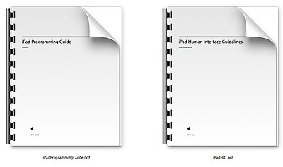
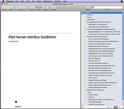
If you are thinking of developing apps for the iPhone or iPad, download the Apple Human Inferface Guideline and study it. It will be the best investment in time and effort you can make if you want to participate in this next platform evolution. [Permalink] -iPad Human Interface Guidlines
|


