The iPad is a great example of how difficult it is for some folks embrace new/different things. For the first time in thirty years a new computer interface has been created, Nintendo PowerGlove, Wii controller, etc. notwithstanding. In recent weeks, we have seem many attempts to "convert" the iPad into a portable laptop. Not only do we see these efforts as folly and doomed to fail, we believe they are a hindrance to the development of a better computing interface.

The multi-touch user interface made a huge splash at the TED conference on February 2006 in Monterey CA. A different and more limited version of multi-touch technology became widely available with the release of the first iPhone. With the iPad, Apple has pushed multi-touch interaction a few more steps toward general acceptance. Trying to make the iPad LOOK and WORK like a laptop is silly and the user experience will be frustrating. Besides showing a total lack of imagination, trying to remake the tablets into laptops will ultimately end in failure. Instead, we should be exploring and expanding the boundaries of the touch interface and the tablet form factor.
A touch-based user interface is very different from the mouse/pointer centric one. The concept of "hovering" does not exist in the multi-touch world (yet). This has created a host of problems for sites with pop-ups ads that get triggered by a mouse pointer's position. Websites designed for a mouse might be difficult to navigate using a finger, especially if the hyperlinks are small and require precision pointing/clicking.

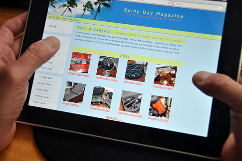
The interface of RainyDayMagazine is actually very well suited for navigation on the iPad. The tabs and links to the stories are on side of the page, allowing easy tapping by the thumbs. There is a blank area on the right of the page for flicking/scrolling. All of the image icons are hyperlinked to correspondng articles, as are the text descriptions underneath. Since this was our basic design going back to 2004, all of the pages may be easily navigated using the iPad multi-touch UI. We didn't plan it as such, but we are happy that it worked out this way.
One company that didn't just luck into a good iPad UI is Vito Technology. They took full advantage of the iPad's multi-touch UI capabilities when designing StarWalk for the iPad. The iPad version of StarWalk has a lot more room for their gorgeous graphics and interface elements. They have also discovered that it is convenient to have the buttons aligned vertically on the side of the screen.

Their most compelling UI element is the "Star Spotter" capability. When holding the iPad up, the user will see the section of the sky as it would appear if the stars could be seen (great for the day time and on cloudy nights). Moving the tablet will cause the content to scroll...no arrow buttons, no clicking and dragging with the mouse, just a clean intuitive way to interact with the content.

Remember when we said the iPad was going to change everything and that children books will be one of the most impacted areas? Disney has reset the bar on interactive children books with the release of Toy Story.

In the story-reading mode, there is an option to stop and do some finger painting. The way to erase and start over is not with some "magic eraser", but by doing the same thing one would do with an Etch-A-Sketch...turn it upside down and shake it. While the gesture is cute little nod to something many of us played with from childhood, it is not an intuitive gesture. It has meaning only because of the widely popular gadget. However, the tablet form factor coupled with the touch screen UI allows creates more ways a user can interact with a physical device.

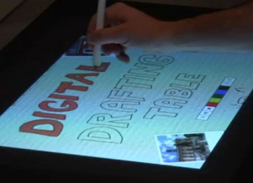
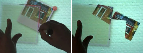
Microsoft has done a lot of work in the multi-touch space. Some of the technology was being demo'ed at the Silicon Valley Tech Fair. One of the more interesting item was their Digital Drafting Table. It demonstrated the use of touch-based gestures in combination with a pen to create some very compelling tools for object manipulation.


To see the complete demo, check out the video here. Take special note of how intuitive and fluid it was to do some of the tasks. Those same tasks would have been very complicated to implement with a mouse/menu interface. As more folks let go of the screen/keyboard mindset, we will see the more and more of the power of the touch UI unleashed. We look forward to touching the future. [Permalink] -Navigating a Touchscreen UI
|

