| Today |
| Carolyn's World |
| Gear & Gadgets |
| Garage |
| Garden |
| Kitchen |
| Unaccompanied Minors |
| Workshops |
| Contact Us |
| Index |
| RainyDayProjects... |
||
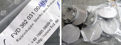
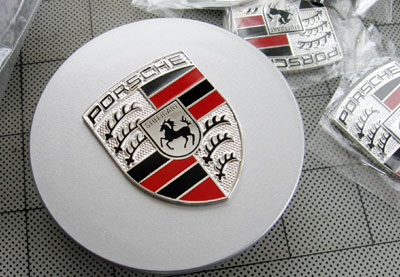
When we first started this project we were going to use thin sheets of aluminum to make the blank covers. Some of the readers on PPBB suggested we just order blank ones from FVD...excellent idea! We ordered 10 of them. We figured we would need 2 sets, plus a few extra because we would probably mess a few up during the prototyping stage of the project.
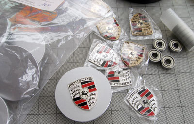
We only ordered 8 crests (4 gold, 4 silver) because they weren't as cheap as the wheel centers. We also found some sealed stainless steel bearing on EBay for another version of the wheel centers.
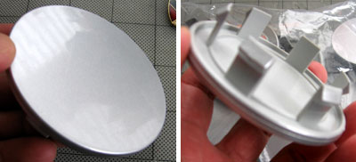
The blank covers were not concaved as the factory Porsche covers, but they do have the same catches in the back. We are trying to decide if it is worth routing out the outline of the crest so it can be sunk into the cover.
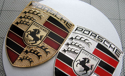
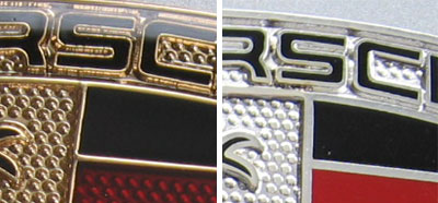
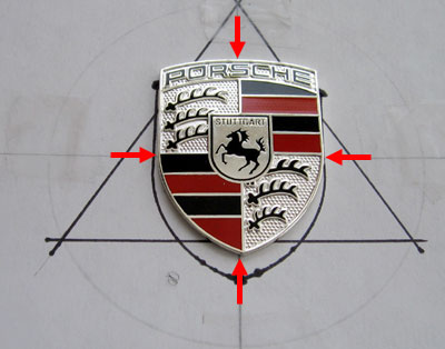
Here are some close ups of the crests. Note the gold crests have a clear epoxy covers, but the silver ones do not. The silver ones are very bright, but we think the gold ones may be easier to clean.
Both the gold and the silver crests are very well detailed and really high quality. They also have the newer version of the horse. We saw some in the catalog for $70 each that did not look as nice.
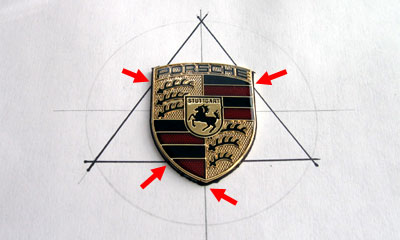
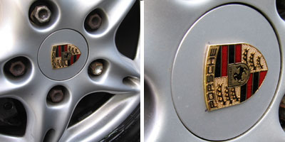
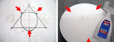
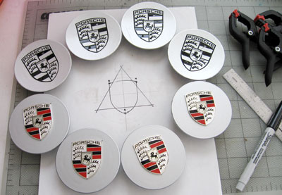
This page will be updated as the project moves forward. We are hoping to finish with this one by the end of the week. One of the slightly troublesome part of this project was how to properly center the crest on the cap. We decided to do it a little more precisely than just "eye-balling" it. We came up with a way, but if you have a better way...drop us a note. If we use it, we'll send you a little something for your efforts. After marking, gluing, and letting everything set, we mounted the wheel cap on to see how it looked.
Some of the aftermarket caps protrude when mounted. We liked the flush look of this cap when mounted. We still have another spare cap. We are going to make one with a Silver crest to see which we like better. UPDATE: After we made a set of the gold ones, we noticed that while the three corners of the mounted crest were equidistant from the edge of the cap, it just looked a little bit "off". The problem was what we were using as the "center". Upon closer inspection of the the crest, it was obvious now that the center of the design was the intersection of the two main axes (duh...).
We mounted a new set using the "horse" as the center. This version looked better to us even though the corners are not the same distance from the edge of the cap. We also decided to mount everything with a few drops of superglue...not that there were any problems with the 3M film, but we didn't want to take any chances.
When we looked at the OEM crests, we realized that was how those crest was centered as well. Most of us liked the look of the smaller crests on the wheel cap better then the OEM version.
|
Porsche Boxster Wheel Center Crests |
|
A set of Porsche Crest wheel centers would have set us back about $400. If you are a long time RainyDayMagazine reader or you have seen our PVC Boxster speaker project, you KNOW we are NOT going to fork over that kind of cash... especially if it is something that can be made in our shop :-)
We knew there were 3rd party crests we available in parts stores and on EBay. We just didn't know if they would be the right size. After searching for a while, we decided the crests for the hood was too large, but the ones available for the steering wheel was good enough. So we got a few to see if they would work for this project. Usually we don't write things up until we are done, but we have been getting requests from you, our readers, to post the project as they progress... so here it is :-) We'll update this project as we move forward. Send us questions, comments and suggestion as you see fit. Wheel Crest Project: Project parts: 1. Blank wheel caps: $28 for 10 2. Gold/Silver crests: $20 each Total cost for a set of 4: $91.20 Note: we purchased the wheel caps and crests in larger quantities to save on shipping cost. We could also have saved more money by buying the crests individually at auction on EBay, but who has time to monitor 8 auctions! We got the first one at $20 and made an offer to buy 7 more at the same price. You may be able to do better :-) We were happy since the catalog price for these crests were $60 each!
|
||

